“Don’t judge a book by its cover,” is a phrase you’ve probably heard before.
The reality is that readers do use cover design to judge books, whether they realize it or not.
It’s universally accepted that authors have 3 to 5 seconds to make an impression on a reader, or the sale is gone.
So it should be your highest priority to create the best cover possible for your book.
Not all authors know how to go about making the perfect cover, so we spoke to Maria Secoy, author of the On-Trail Love Adventures, founder of AllWriteWell, and owner of the AWW Romance Writers Facebook Group in order to create a guide to cover design for authors.
Let’s get right into it!

Key Takeaways
- Book covers are crucial for making a strong first impression and significantly influence purchasing decisions within seconds.
- Authors can design their book covers through DIY methods, purchasing premade covers, or hiring professional designers, each offering different benefits and challenges.
- Effective book covers consist of key elements like title, imagery, color scheme, author name, and optional taglines or testimonials, carefully chosen to appeal to the target genre and audience.
Table of Contents
Free Universal Book Links
- Boost international sales by geotargeting readers
- Book store links update automatically based on availability
- Advanced marketing analytics
- Increase clicks with trusted links
Why a Book Cover is Important
There are three main factors that influence purchasing decisions for readers.
They are:
- Awareness of the book
- The book description
- The cover design
Awareness of your book completely comes down to your book marketing efforts.
Writing an optimized book description is also essential to hook readers in with words.
Tip!
- A perfect book cover design allows you to insert ideas of what your book’s about better than words ever could.
Online bookstore algorithms determine the organic placement of books by looking at the conversion rate of the book’s sales page.
This means the percentage of viewers who view the book and purchase it is one of the key factors to determining how high your book will appear in search results.
Amazon and other stores want to continue to boost books that are already selling well.
This gives book covers the ability to completely destroy your book sales, or make them happen while you’re busy writing your next book.
We can prove this by taking a look at a few examples.
If we first take a look at Amazon’s best-seller list of Mystery & Suspense Romances, they all follow a very clear theme.
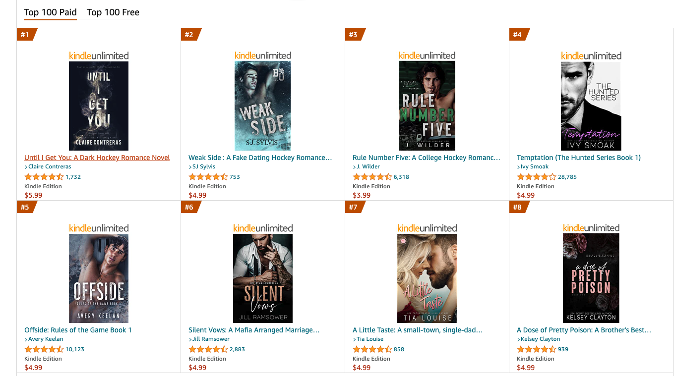
All but two of these romance covers include a character, and in the covers with a character, we see at least half of their face.
So we know that if we want our book to be on the list of best-selling mystery & suspense romance books, it’s likely we’ll want to include a character with at least half of their face visible.
On that same note, considering romance is a genre read almost exclusively by women, this will likely be the male character in the story.
Book titles in these examples stand out in one way or another, with generally one word emphasized.
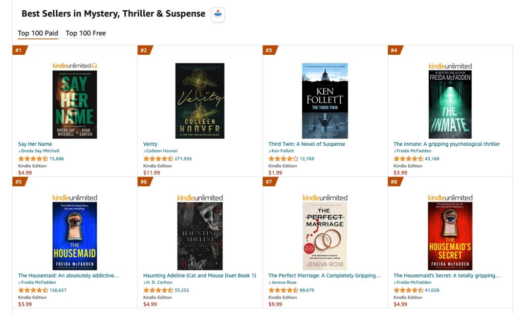
We’ll take a look at one more example with best-selling mystery, thriller, and suspense novels.
All of these covers follow a similar theme as well.
Can you pick up on what these themes are?
Notice how we don’t see a single character in any of these covers.
You could make an argument that Say Her Name does, but it’s not really clear enough to give the reader any ideas.
So if I’m writing in the Mystery, Thriller, and Suspense category, it’s clear I want to avoid including characters.
Instead, go for more symbolic imagery, whether it’s a capitol building, smoky fog, or marriage rings.
Think: what symbol represents my book?
And put that on the cover.
Tip!
- Notice how much more important the coloring is in these examples compared to the romance genre.
Now that you’ve seen a few examples and have some background on the details of book covers, let’s jump into our guide on how to make a best-selling book cover!
Introducing:
Booklinker Collections
One landing page for all your books. 100% free.
One link for easy sharing of your books across your backmatter, websites, emails, and social media.
How to Make a Book Cover
You have three main options when it comes to creating a cover for your book.
- Doing the cover yourself (DIY)
- Buying a premade book cover
- Hiring a designer to make a custom cover for you.
All options are completely viable in 2023, with each having different pros and cons.
Below, we’ll discuss each option in depth so you can decide what route is best for you.
Do it Yourself
The first option authors have when it comes to designing a book cover is to design the cover themselves.
This design work is typically done inside a photo editing tool such as Canva or Photoshop.
I don’t recommend this option for most authors.
Not only do you need to own the design software, but more importantly, you’ll need the skills and marketing knowledge to create a best-selling book cover.
As much as we’d all like to think we have this knowledge, most of us don’t.
Tip!
- There is a misconception out there that designing a cover yourself is the cheapest option, but this is not necessarily true.
Between the cost of cover design software, licensing of illustrations, and buying fonts, it can get pricey.
Design software ranges from $12.99/m (Canva) to $21/m, while images can be anywhere from $80-$100 each for commercial use. The cost of licensing a single font can be $40-$50.
An issue with digital libraries like Canva is that many of their fonts and images are subject to the terms of service of the Canva platform.
These terms are severely limited, with many restrictions on resales. For example, I tried to make a DIY cover one time using a photo I took and a font found on Canva Pro.
The only issue?
The font was only allowed for 1,000 resales. Despite not being a famous author, I typically clear the 1,000 copy download mark within 6 months of releasing a book.
It’s not wise to change a cover that quickly, so that font went out the window.
That being said, if you do decide to go the DIY route, start investigating book covers and design elements that you like in bookstores, online stores, and sites like Pinterest.
The more book covers you find that you like, the better. When studying examples be sure to reference ones that belong to a group of books that you want your book to fit into.
Who Should Design Their Own Book Cover: This option should only be used by authors with the necessary tools and a background in cover design that want a high level of control over everything.
Premade Book Covers
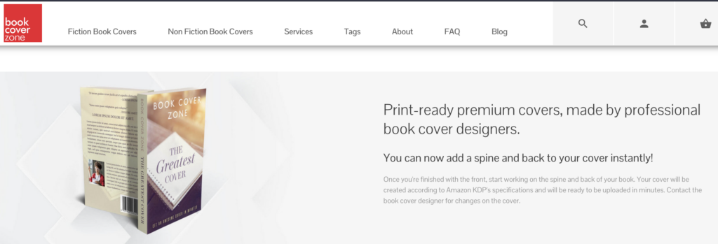
The second option authors have for their book cover design is premade covers. Premade book covers are available in online libraries, where professional graphic designers post templates.
I know what you’re thinking.
“I couldn’t possibly use a premade book cover for MY book.”
You’d be surprised by the number and quality of premade book covers out there.
Browse premade book cover design sites like BookCoverZone and find some that resonate with you. It’s common for the premade book covers to inspire authors to take certain directions in their story that relate to the cover.
These designers focus heavily on market trends and will use elements and designs of what’s popular on the market to convert at the highest rate.
All you need to do is provide the title and author fields to the premade cover designer, and they’ll insert them onto the cover for you.
Premade book covers can be one of the most cost-effective options out there, at a price point of only $75-$300 for a cover design.
Who Should Use a Premade Book Cover: This option is best for authors that want simplicity. Brand new authors can get overwhelmed with everything that goes into producing a book and may want to reduce the amount of friction involved in getting a book live.
It can also be a great option for authors who are more cost-conscious as it’s typically going to be the cheapest option.
Hire a Professional
The last option authors have for creating a book cover is hiring a professional and working with them from start to finish.
This is easily the most expensive option but will give you the most personal touch.
If your custom cover will use stock photography, the cost of this option is typically between $200 and $500.
If you are looking for custom photography or illustrations, expect costs to reach up to $1000 for a single cover.
When working with a professional, it’s best to have a swipe file handy for information for them to work from.
Tip!
- Professional designers are not mind readers who know exactly what you’re looking for. They don’t know anything about your book beyond what you tell them.
Here are some things to provide the designer so they better understand what you are looking for:
- Fonts you like
- Color schemes
- Images
- Comparable covers
When the designer sends you cover ideas, provide detailed feedback. Share what you liked and what you didn’t. For example, “I like the font from sample #1 and the colors from sample #3.”
If you don’t know where to find a designer, some options include Reedsy, Get Covers, 99Designs, Behance, Dribble, and Upwork.
Who Should Hire a Professional Book Cover Designer: This option is best for authors who want to build an author business. These authors should already be incorporating market research into their work and should have a strong understanding of their genre.
This option is particularly appealing for authors who are writing a series and want to ensure that their artwork stays consistent throughout.
Aspects of a Book Cover
Tip!
- In order to start plotting your dream book cover, you should understand what elements go into an effective cover.
Even if you are hiring a designer, it’s good to know this information.
Below, we’ll break down each part of a book cover, and some information about each.
Book Title
The first and most obvious aspect of a book cover is going to be the title. It goes without saying, this should be in the largest font.
The title of a book should be placed go bottom, center, or top, blending into the rest of the design.
Fiction titles should be short.
Six words is certainly too long. 3-5 words is a good place to be at. Bonus points if you can get all the way down to two words.
Nonfiction can include a longer subtitle to better understand the topic covered in the book.
The title is where you can be a little creative with the font that you use, though it’s always best to limit your creativity to no more than two or three fonts on any given cover.
Google Fonts is a great place to find lots of free and uncopyrighted fonts.
The best book title tip I have is to announce it to the people you encounter in your everyday life.
If you’re embarrassed to say your title, other people likely will be too and won’t be encouraged to share it.
If your tongue trips over the words, then it’s not a clear title.
You want it to be easy to remember and make it clear to your audience what the book is about.
Manage all of this and you’ve got a winning title.
Images
Likely the second most important aspect of a book cover is going to be the actual graphic content on the cover.
You don’t want the book cover to look cluttered.
The most important thing when it comes to book cover images is to ensure that your images are high-resolution. Aim for at least 300 DPI (dots per inch). Screenshots are not going to be high-quality enough.
Stock images can work on book covers, just be sure to look into the copyright implications of them and to download the high-resolution images.
AI Images are a bit of a gray area at the moment, as the US courts are currently deciding whether these images are subject to copyright. So it’s best to hold off on any AI art.
Book Cover Colors
While we’re on the topic of design, it’s also important to discuss optimal book cover colors.
Whatever color scheme you go with, it should work throughout the cover. The best way to come up with colors is to look at your genre and identify if the readers prefer bright or dark. Pick one focal color to draw the reader’s eye.
Author Name
Next up, is the author’s name.
This is a necessary element to ensure the book is clearly attributed to you. The name should be presented in an easily digestible manner.
Don’t use any fancy fonts or cursive, as it shouldn’t be a focal point of the book cover.
There are really only two choices when it comes to book cover placement, and that is either the top or bottom of the cover.
A majority of the time, the author’s name is on the bottom, unless other design elements force it to be placed at the top.
Tagline
Taglines are an optional component of a book cover and support the cover via supporting text and help build interest in the book.
This can also be where you notify the reader that the book is part of a series. It may make sense to hold off on a tagline until you’re a more experienced author.
Reviews or Testimonials
You may have seen editorial reviews or testimonials on some book covers.
I only recommend this for the more experienced authors.
If you have an editorial review from a major publication, then consider placing it on the cover assuming it fits.
It shouldn’t distract from any of the other elements and be in a similar size font to a tagline.
Book Cover Dimensions
The next decision you have when creating a book cover is deciding the dimensions. eBooks and physical books have different formatting and dimensions.
Every author should consider publishing in both paperback and ebook, to provide readers the option to choose which format they like best.
For an ebook, there isn’t really anything up for discussion on the right book cover dimensions, it must follow the ratio of 1.6:1.
Paperback dimensions are where we get into a bit more of a discussion on the optimal size.
Amazon claims 6×9 is the most popular size, while readers have said survey after survey that they prefer 5×8.
Optimal print dimensions vary by genre, but for the most part, consider 5×8 or 5.5×8.5. 6×9 can make more sense if you’re writing an epic fantasy and want to have longer pages in order to shorten the page count.
In our current world, the only time we’re selling hardcovers is for a special edition as part of a Kickstarter to fund the book writing before publishing.
Other than that, I wouldn’t worry about setting up your book in hardcover because they just don’t sell as well.
Matte vs glossy is always a big debate, but it ultimately comes down to personal preference.
Generally speaking, glossy is going to be much more durable whereas matte is going to photograph better.
How to Test a Book Cover Design
If you’ve made it this far, you’re armed with everything you need to know to get started working on your book cover.
When the time comes, it can be helpful to test it.
I have a few tips to help you validate the design.
The first one is to post it on social media.
If you ever get to the point where you’re down to two covers or two design elements and can’t decide, assuming you’ve curated an author’s social media account, this would be a great place to ask for feedback.
If one version receives more engagement than the other, it can be a signal that it’s the winning variant.
Reader Facebook Groups, the #Bookstagram hashtag on Instagram, and the #BookTok hashtag are perfect places to get feedback from readers.
Do NOT ask friends or family for feedback on your book cover.
They love you and will not want to hurt your feelings with any negative feedback.
The whole point of asking for feedback is to reach your readers. The demographics of your friends and family are not necessarily going to align with your readers.
Examples of Successful Cover Design
The Housemaid
The first book cover example we’re going to take a look at is The Housemaid.
The book has over 125,000 reviews, so Freida McFadden is clearly doing something right.
This cover is a great example that a clear and clean font works well. McFadden didn’t try and get super fancy with it. In this example, the author decided to include a tagline:
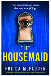
“From behind closed doors, she sees everything.”
This makes a great addition as it matches perfectly with the imagery on the cover, a woman’s eye looking through the keyhole of a door.
Really, the beauty of this book cover is in its simplicity.
Things We Never Got Over & A Not So Meet Cute
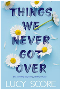
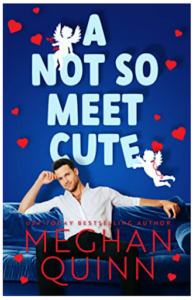
The book covers of Things We Never Got Over and A Not So Meet Cute are great examples. Both covers have unique fonts with crisp, simple-to-read author names.
Both titles are the largest part of the cover, but it’s where they got creative. There are pretty much only two fonts used, which is best practice.
Lucy Score technically has a 3rd, but it’s so small it’s hard to even see it. Both of these have very clear primary colors, blue, helping to keep the main focus clear.
In Lucy Score’s case, the daisies help bring the whole “He loves me, he loves me not” theme together.
Megan Quinn’s main focus is the handsome man on the couch with backup designs in the form of hearts and cupids.
The main takeaway here is that these covers don’t attempt to give away everything the book has to offer. They just highlight one central focus.
The Stopover by TL Swan
The next book we’ll take a look at is TL Swan’s The Stopover.
This one wasn’t as large of a hit as the others, but with almost 60,000 reviews, its performance proves you can be a 6-figure author with a simple cover design.
This is a beginner cover, but I truly mean it in the best way. Any new author can replicate this book cover.
It’s simply a stock photo of a guy on a black background.
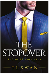
We have the author’s name written clearly at the bottom, and a clean, clear, Google font for both the title and the series.
There are no crazy colors here, just a few that contrast well with each other.
Frequently Asked Questions
Should I Ever Re-cover My Book?
Book Cover Genre Quiz
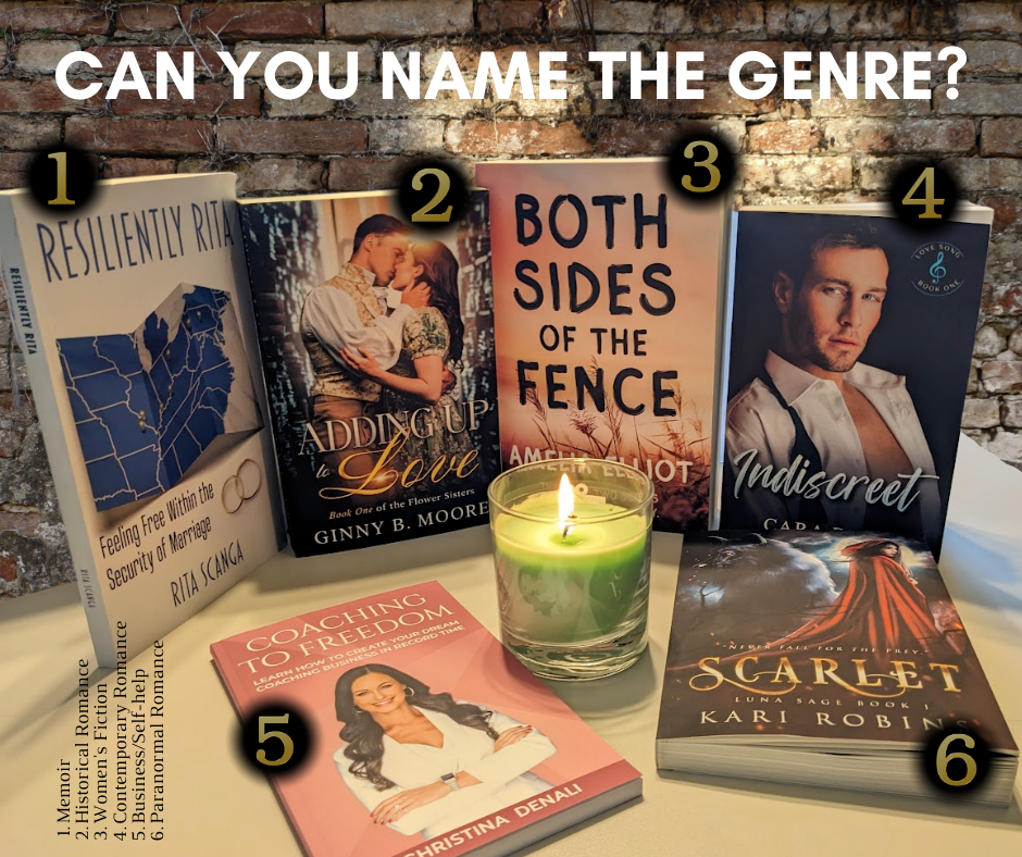
Here’s a fun quiz for you all, can you guess the genres of each of the books shown above?
Let us know in the comments!

Introducing:
Booklinker Collections
One landing page for all your books. 100% free.
One link for easy sharing of your books across your backmatter, websites, emails, and social media.
Author
-
Maria founded All Write Will with the mission of helping other romance writers make the leap into earning income as published authors. Her team of support includes editors, proofreaders, and a graphic designer to ensure self-publishing authors have access to all the support they need without giving up control & ownership of their work or spending their writing time managing a team of their own. Because of her signature approach to shifting from writer to author, Maria was able to achieve her goals as an author from day one. In her first year publishing under her own name, she wrote and released 4 books, sold more than 4000 copies, and was earning steady royalties.
https://allwritewell.com


